Can we add a dark mode toggle to Jumpstart Pro/Rails?
How can we support dark and light CSS modes, using both system preferences and a dark mode switcher on our Jumpstart Pro apps? Or any Rails + Tailwind CSS + Stimulus JS app.

Yet, in a 2023 survey over 80% of smartphone users use dark mode. "Instead of having bright displays, the darker background is easier on the eyes, and makes it easier to read content."
Jumpstart Pro built-in theme is a lovely light mode theme. However, at the time of writing, the built-in theme, HTML templates, and CSS files, do not implement any dark mode ideas.
But wouldn't it be awesome if it did?
Fortunately JSP heavily integrates with Tailwind CSS which has lovely dark mode support via a dark: class variant.
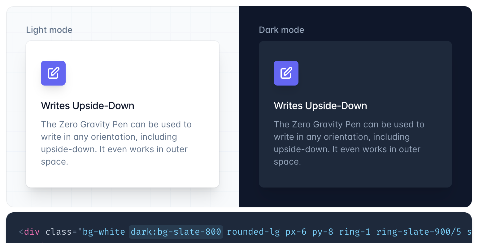
Reading the classes left to right:
- Make the background
white. - However, if dark mode is enabled, make the background
slate-800.
You can use this pattern everywhere: background, text, borders, hover, etc.
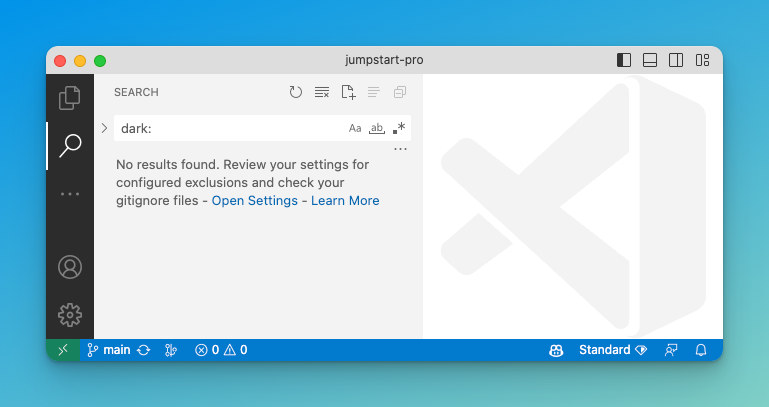
We can see that JSP does not yet implement any dark mode variants by searching for dark: in the code base.
Whilst you're implementing dark mode you'll want to toggle between dark and light mode to check that each page and each component looks good.
In this article we will add a toggle button to your app's navbar to allow a user to toggle between light and dark mode, but also supports their system preference by default.
The core ideas in this article are applicable to any Ruby on Rails & Tailwind CSS & Stimulus JS app. The specific file names match to those known to me in JSP applications.
How's it work?
Your site will appear light or dark based on the user's system settings, until they click on the dark/light toggle button. Then the browser will remember their choice and ignore their system setting. Whenever they return to your site it will use the explicit choice they last made.
As a secret feature, double clicking the toggle button will reset their stored preference and resume showing the current system preference.
Setup your Rails app
For any Rails app, including a Jumpstart Pro app, there are 3 steps:
- change
tailwind.config.jsto allow dark mode to be configured manually - add our new toggle
<button>into the navbar, and - add a StimulusJS controller that implements the toggle dark mode button.
After that, I'll cover some JSP specific changes.
Configure dark mode manually
By default, Tailwind will activate dark: class variants based only on the user's system preferences.
We want to be able to control whether we show dark mode or light mode, so will need to reconfigure Tailwind CSS to enable dark mode manually.
Add darkMode: 'class' to tailwind.config.js.
module.exports = {
  darkMode: 'class',
  // ...
}
Later, our StimulusJS JavaScript will add or remove the dark class on the page's root <html> element based on the user's preference: either because they toggled the button, or their system preference.
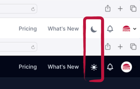
Add toggle button to navbars
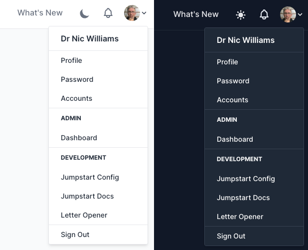
The JSP navbar looks differently for desktop and mobile. I think we want to add the dark mode toggle button into two different places respectively.
So, we will create a new partial app/views/shared/_toggle_dark_mode.html.erb for our dark mode toggle button. It is a <button> wrapped around two <svg> icons: a "light" icon and "dark" icon, which indicate that clicking the button will change the mode to light or dark, respectively. Only one of the two <svg> will be visible at a time; and the other is hidden.
<button data-controller="dark-toggle" data-action="dark-toggle#toggle dblclick->dark-toggle#resetSystemMode" type="button" class="inline-block align-middle nav-link">
  <svg data-dark-toggle-target="dark" class="hidden w-6 h-6" fill="currentColor" viewBox="0 0 20 20" xmlns="http://www.w3.org/2000/svg"><path d="M17.293 13.293A8 8 0 016.707 2.707a8.001 8.001 0 1010.586 10.586z"></path></svg>
  <svg data-dark-toggle-target="light" class="w-6 h-6" fill="currentColor" viewBox="0 0 20 20" xmlns="http://www.w3.org/2000/svg"><path d="M10 2a1 1 0 011 1v1a1 1 0 11-2 0V3a1 1 0 011-1zm4 8a4 4 0 11-8 0 4 4 0 018 0zm-.464 4.95l.707.707a1 1 0 001.414-1.414l-.707-.707a1 1 0 00-1.414 1.414zm2.12-10.607a1 1 0 010 1.414l-.706.707a1 1 0 11-1.414-1.414l.707-.707a1 1 0 011.414 0zM17 11a1 1 0 100-2h-1a1 1 0 100 2h1zm-7 4a1 1 0 011 1v1a1 1 0 11-2 0v-1a1 1 0 011-1zM5.05 6.464A1 1 0 106.465 5.05l-.708-.707a1 1 0 00-1.414 1.414l.707.707zm1.414 8.486l-.707.707a1 1 0 01-1.414-1.414l.707-.707a1 1 0 011.414 1.414zM4 11a1 1 0 100-2H3a1 1 0 000 2h1z" fill-rule="evenodd" clip-rule="evenodd"></path></svg>
</button>
The data-controller="dark-toggle" attribute matches to the dark_toggle_controller.js StimulusJS controller we will create soon.
The data-action="dark-toggle#toggle dblclick->dark-toggle#resetSystemMode" attribute sets up event handlers:
- On click event, call the
togglemethod on the StimulusJS controller - On double-click event, call
resetSystemModemethod.
We will implement these methods soon.
The nav-link class comes with JSP and is used for the other links in the navbar.
Add the following to your navbar:
<%= render "shared/toggle_dark_mode" %>Later, I'll cover some specifics for JSP's desktop and mobile navbars.
StimulusJS controller
Finally, for any Rails app, we need the StimulusJS controller for the <button data-controller="dark-toggle"> above.
Create a new file app/javascript/controllers/dark_toggle_controller.js:
import { Controller } from "@hotwired/stimulus"

export default class extends Controller {
  static targets = ["dark", "light"]

  connect() {
    this.assignCurrentMode()
  }

  toggle() {
    this.lightTarget.classList.toggle('hidden')
    this.darkTarget.classList.toggle('hidden')

    // if set via local storage previously
    if (localStorage.getItem('color-theme')) {
      if (localStorage.getItem('color-theme') === 'light') {
        this.setDarkMode()
      } else {
        this.setLightMode()
      }

      // if NOT set via local storage previously
    } else {
      if (document.documentElement.classList.contains('dark')) {
        this.setLightMode()
      } else {
        this.setDarkMode()
      }
    }
  }

  resetSystemMode() {
    localStorage.removeItem('color-theme')
    this.assignCurrentMode()
  }

  assignCurrentMode() {
    if (localStorage.getItem('color-theme') === 'dark' || (!('color-theme' in localStorage) && window.matchMedia('(prefers-color-scheme: dark)').matches)) {
      this.lightTarget.classList.remove('hidden')
      this.darkTarget.classList.add('hidden')
      document.documentElement.classList.add('dark')
    } else {
      this.lightTarget.classList.add('hidden')
      this.darkTarget.classList.remove('hidden')
      document.documentElement.classList.remove('dark')
    }
  }

  setLightMode() {
    this.lightTarget.classList.add('hidden')
    this.darkTarget.classList.remove('hidden')
    document.documentElement.classList.remove('dark')
    localStorage.setItem('color-theme', 'light')
  }

  setDarkMode() {
    this.lightTarget.classList.remove('hidden')
    this.darkTarget.classList.add('hidden')
    document.documentElement.classList.add('dark')
    localStorage.setItem('color-theme', 'dark')
  }
}
What's going on here?
When a new user arrives, the assignCurrentMode() function will determine if the user's system preference is dark mode or not, via window.matchMedia('(prefers-color-scheme: dark)').matches.
If dark mode, then hide the "dark" icon (the moon) and show the "light" icon (the sun). More importantly, we add dark class to the <html> element.
Conversely, for users who do not have a dark-mode preference, we hide the list/sun icon, and show the dark/moon icon.
If the user toggles the button, we do three things:
- Toggle which icon is shown
- Toggle
<html class="dark"> - Store the user's preference into
localStorageinside the browser.
When the user revisits the site, we use their localStorage setting, instead of their window.matchMedia system preference.
Setup a JSP app
Our Jumpstart Pro app has a navbar that works slightly differently in desktop and mobile viewports. I think we want to place the dark mode toggle button in two different places for desktop and mobile respectively.
Therefore we will add the toggle button partial into two places inside the app/views/shared/_navbar.html.erb partial.
For the desktop design, add the button before the notification icon around line 21:
      <%= render "shared/right_nav" %>
      <% if user_signed_in? %>
        <div class="hidden lg:inline-block">
          <%= render "shared/toggle_dark_mode" %>
          <%= render "shared/notifications" %>
        </div>
For the mobile design, add the button around line 30. Note, the line after account_avatar I've added the grow class; and removed bg-white from the notifications_path link.
        <!-- Mobile menu -->
        <div class="lg:hidden mt-2 pt-4 pb-2 border-t border-gray-200">
          <div class="flex items-center px-2">
            <div><%= account_avatar current_account, include_user: true, class: "rounded-full h-10 w-10" %></div>
            <div class="grow ml-3">
              <div class="text-base font-medium text-gray-800"><%= current_account.name %></div>
            </div>
            <%= render "shared/toggle_dark_mode" %>
            <%= link_to notifications_path, class: "ml-auto p-1 rounded-full text-gray-400 hover:text-gray-500 focus:outline-none focus:ring-2 focus:ring-offset-2 focus:ring-blue-500" do %>
Introducing dark theme to Jumpstart Pro
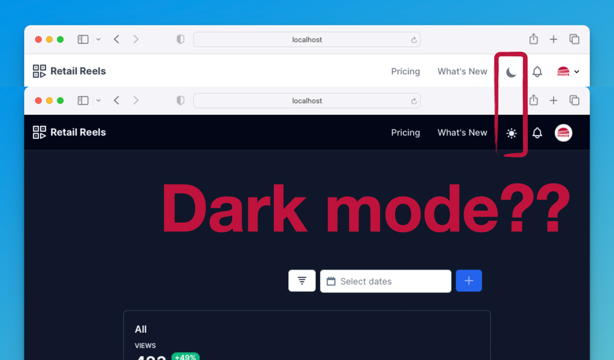
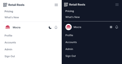
There's a lot of work to be done to JSP templates and .css files to fully flesh out a dark mode. In my sample image, I've shown the navbar with dark mode. So here's how I did that.
At the top-level <body> we can add some dark variant classes, in app/views/layouts/application.html.erb:
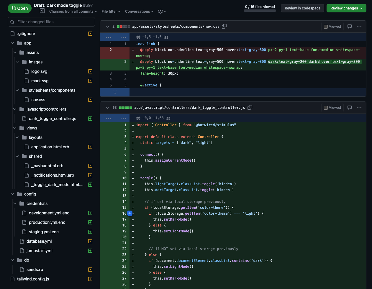
<body class="h-full font-sans antialiased font-normal leading-normal bg-gray-50 dark:bg-slate-900 dark:text-slate-50">And it goes on and on from there. I've started adding changes to a JSP pull request:
https://github.com/jumpstart-pro/jumpstart-pro-rails/pull/697/files
Will JSP have dark mode one day?
Oh god, hopefully Jumpstart Pro implements dark mode in future. It's very fiddly figuring out where to place dark: class variants through out all the partials and generators.
Thanks
The original implementation for this dark mode toggle-with-system-default solution came from the Flowbite blog, which I adapted to Stimulus JS.